Meridian Farm Market
Onboarding

Project overview
Historically, visitors interested in shopping on Spud had to go through disjointed steps to create an account and checkout - a cumbersome process that led to high drop-off rates.
To reduce friction for users, we redesigned the onboarding flow with plans for future enhancements. I was the main designer leading this project in August 2021; I ideated early concepts, presented regularly to stakeholders, delivered final assets for production and supported dev QA. I worked with cross-functional team members including a project manager, an implementation lead, 5 developers, 2 QA engineers, and customer care representatives.
This project was part of a brand new e-commerce solution for Spud’s retail client. Spud itself planned to migrate onto this new platform, so the goal was to replicate and improve Spud’s existing model. This was one of my favourite projects, but sadly it only launched for a short bit due to shifted company priorities.
How it works
 Strategic copy to incentivize users
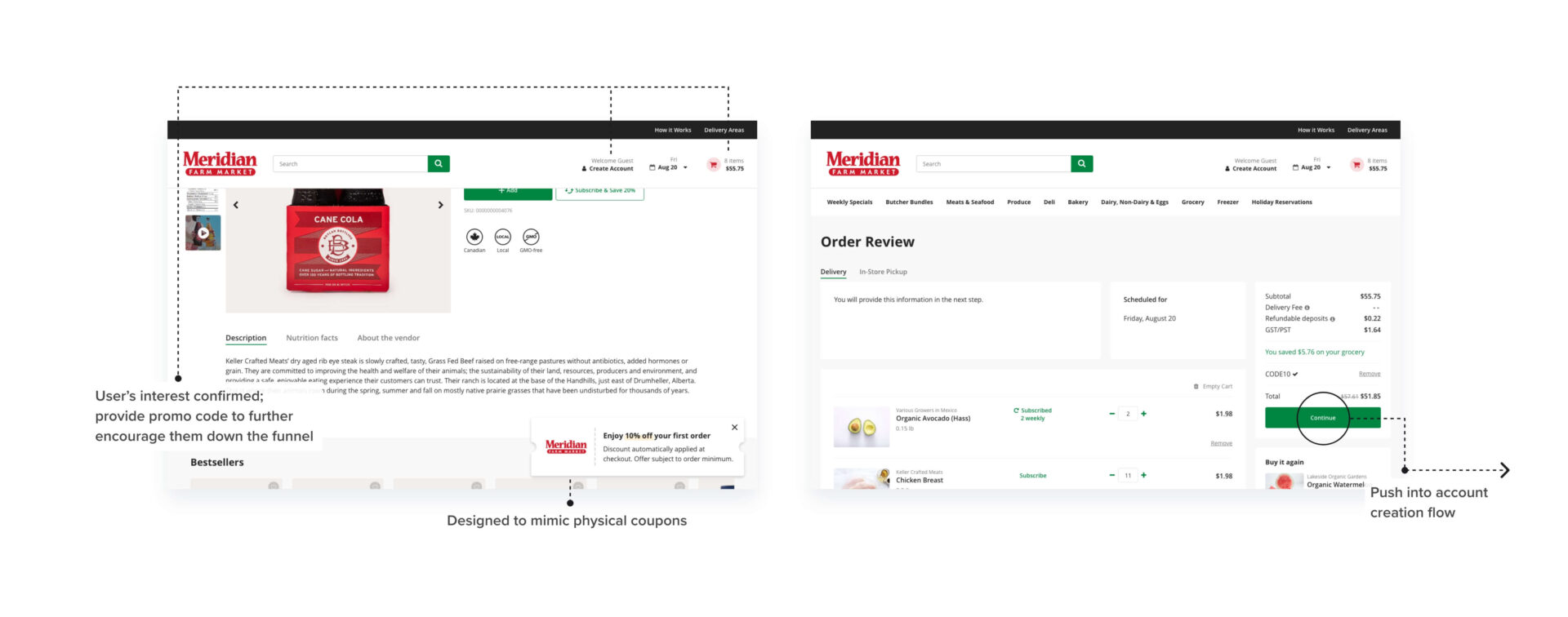
With Spud’s open cart, the site inventory is based on the user’s postal code and delivery date. Spud already does a great job of minimizing friction in the onboarding funnel by allowing visitors to casually browse, and only asking for these information when they click “Add to cart”. To improve upon this step, I added space to clearly promote our value propositions and further nudge the users down the funnel.

Streamlined onboarding process
Spud regularly gets complaints about the confusing signup process. When visitors checkout for the first time, after creating a user id they are taken to an address page within the account settings, and they have to find their own way back to the checkout page. After that, they are taken yet again to the payment page in settings, and they have to manually checkout again - all of which can be disorienting and frustrating.
The redesign combines it all into three simple steps - creating an account, adding an address, and a payment method. Each step is clearly marked to guide first-time users and help them feel confident about their next steps, and each step has a ‘Skip for now’ option so that users have clear exit points (their progress will be saved, and they can always come back to it when they’re ready).
The initial idea was to simplify it even more by combining them into a single page, but this proved to be too complex. A single-page format wouldn’t really be flexible for scenarios where the user manually adds their address or credit card through account settings. By breaking it down into three steps (or four including postal code and delivery date validation), we can transport users to whichever information that’s missing in order to ensure a successful first-time checkout.


Improved credit card form
Spud’s payment page creates a lot of confusion due to poor design (eg. Inappropriate usage of icon, card type separated from card details, perpetual error message). I worked with the developers to understand the key information required by the payment provider, and arranged the form so that it better correlates to users’ mental model of a typical credit card. I also opted to display the logos for the accepted cards, which switches to just one (or none) as the user starts to type in the digits to provide immediate feedback on whether their card will be accepted or not. I also redesigned the layout of the form so that it better correlates to how the information is laid out on real credit cards.

Progressive information disclosure to set user up for success
The open cart gives incredible flexibility for managing one’s order, but at the time there was little to no information about it on Spud’s website (how to use, order deadline, when user will be charged, etc.). In the redesign, each step clearly communicates the value propositions and how the open cart works - including order deadlines and when users will be charged to educate users, increase interest, and further encourage them along the funnel.
These may seem basic, but they were some of the most asked questions for Spud since customers couldn’t find the information on the site (and casual visitors are rarely motivated to go digging for answers)!

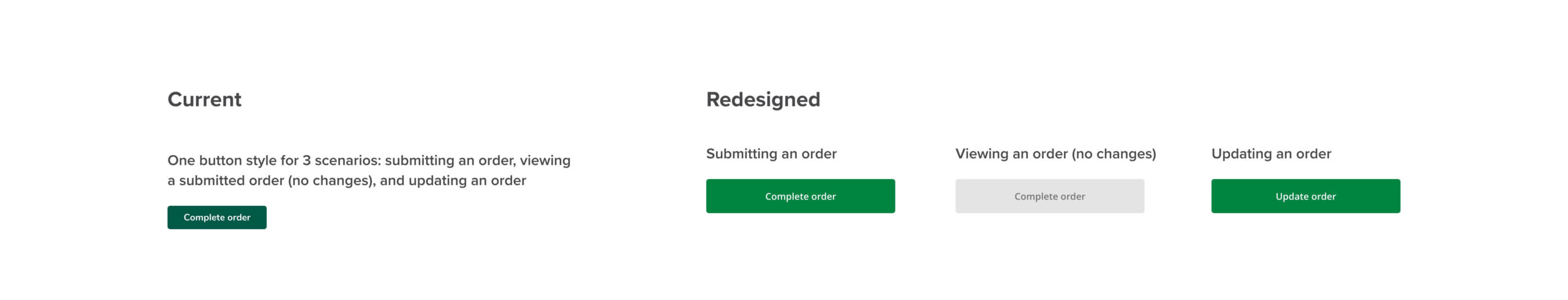
Dynamic buttons to align with user expectations
The checkout button on Spud always says “Complete order”, whether the user is submitting the order for the first time, or updating their order after editing their cart. This creates a lot of confusion for customers, who wonder if they will be charged twice if they make any changes to their order. The redesign improved communication with dynamic button copy that match users’ expectations (“Complete order" for first-time checkouts, and “Update order” for any changes that are made to that order).
Further enhancements
Additionally, I designed enhancements using the first checkout promo code to further reduce the drop-off rate. Spud always had its new customer promo code in the header, but user testing revealed that it gained little recognition from users and was in need of re-evaluation.
I re-imagined the new customer promo code as an important part of the onboarding experience in the four scenarios below. These received great feedback from the client and internal stakeholders and were deemed a priority for Spud’s migration. Unfortunately, they weren't implemented for the client due to a restricted timeline.
Footer email signup
- Target: Visitors who haven’t validated their postal code
- Feedback: Trigger a popup with promo code (also send as email)
- Goal: Motivate visitors to start a cart, and collect their email address for retargeting campaign

Promo code for users who validate their postal code, then become inactive
- Target: Visitors who validated their postal code but did not sign up for emails or start a cart, and has been inactive for xx minutes
- Feedback: Trigger a popup with promo code. If the user provides their email, provide the promo code (also send as email), or, if they close the popup, display a banner to give easy re-access for when they are ready
- Goal: Acknowledge that some users may need more time before deciding they want the promo code (sometimes when I’m shopping I get a popup asking for my email in return for a promo code before I even had a chance to browse. If I see something I want, I have to try a bunch of things to somehow trigger the popup again). Be courteous and build trust by giving the option to get a promo code. If the user decides to get it, it can encourage users to submit an order for the current flow or return later to make a purchase (and also collect email for retargeting)

Promo code for users who validate their postal code, who add item to cart then becomes inactive
- Target: Visitors who validated their postal code and started a cart
- Feedback: Trigger a coupon alert when the user has been inactive for xx min
- Goal: Recognize the user’s inactivity or exit intent, and encourage them to checkout. At this point the user confirmed their interest in the site, so a gentle nudge can help funnel them into the account creation (and checkout) flow
Promo code for users who finish creating their account
- Target: users who finished creating an account and did not sign up for emails
- Feedback: Trigger a personalized popup with promo code (also send a welcome email with code). Automatically apply the code at checkout; if the user abandons the cart, save the code to their order so that it can be applied to their first cart
- Goal: Reward customers for creating an account and welcome them to the site!If they abandon the flow, the welcome email with the code could motivate them to return

Results
The designs received great feedback during the client’s Family & Friends launch in April and May 2022, with users commenting the site was “super easy and convenient” and “easy to navigate” with no complaints around account creation and initial onboarding, which indicates the redesign is a direction for improvement.
(or just drop me a line to say hello  )
)
All Rights Reserved © Kristine Hur 2022