BrainStation Capstone Project
Citrus+

Project overview
Citrus+ is a conceptual iOS solution for managing dental and medical treatment priorities, booking appointments, and discovering healthcare services. It was my big capstone project from when I attended BrainStation, and I worked on it over a period of 10 weeks in tandem with other assignments. It was featured on the BrainStation blog as one of the top UX design projects from winter 2020.
When exploring my thesis options, I wanted to develop a solution that would solve real-life problems. I have always been interested in healthcare and discovered this problem space through friends who were working in the field. I wanted to explore a solution that would help make their job easier (and also benefit patients), and a UX capstone project seemed like the perfect opportunity for exploration.
Problem
Dental receptionists stand at the frontlines of patient communication. They perform new patient intakes, making sure everyone feels welcome and correct forms are filled. They take calls, conduct post-exam communications, collect payments, and file insurance claims - all the while handling in-clinic situations as they arise. And while patient scheduling is a crucial part of their job, competing priorities can make it challenging to keep schedules filled.
Understanding the problem space
In my initial research of the problem space, I learned that 85% of a typical practice’s expenses are fixed, so effective scheduling directly impacts clinic profitability. However, it takes over 8 minutes for receptionists to book a single appointment (if they reach the patient at all). Patient expectations are also changing, with more patients saying they prefer to book appointments without having to call.
These findings were in line with my own experience. As a patient, I was always getting calls from my dentist reminding me to book my next appointment. Most times I missed their calls, and had to check my voicemail or call back to connect with a receptionist. As much as I found it to be a tedious process, I knew (from my friends) that it was even more exhausting for the office staff.
 Defining the challenge
I used these insights to craft the design challenge: how might we re-think the patient scheduling experience to reduce the burden on the reception staff, and simultaneously make the process more convenient for patients?
Market research
In 2018, the self-scheduling market was valued at $205 million globally. This figure is projected to grow to $546 by 2026, with much of the growth driven by the healthcare sector as clinics look to minimize no-shows and reduce administrative overhead (Allied Market Research, 2019). And despite the plethora of software options for dental office management, none offered patient-centered apps for scheduling appointments.
User research
I first drafted a short survey to understand patients' communication habits and preferences. The survey targeted anyone over the age of 18 who has had a dental appointment within the past year in BC's lower mainland. Based on 22 responses:
- 71% of the respondents preferred to text (as opposed to receiving calls, emails, and paper mails) with their dental clinics, but only 18% had the option this option
- ‘Convenience & Accessibility’ was ranked the second most important factor in looking for dental care, right after ‘Quality of Services’
I then conducted 5 interviews (3 patients, 2 clinic staff) to verify the data and project assumptions, and found that:
- Patients feel guilty about rejecting proposed dates; back-and-forth with receptionists can guilt patients into accepting a date that isn’t ideal for them
- Lack of transparency around available dates can breed mistrust and make the scheduling process feel like a negotiation
Outside of regular cleaning and checkups, patients also knew little about their dental care. They wanted to know more about preventative care and cosmetic procedures, but the staff always seemed so busy that they weren’t sure when to ask. The general perception of dental care as being non-essential and their preference for texting also kept them from scheduling a call to ask.
My interviews with clinic staff verified these findings. Depending on how the day is structured, staff may not have time to address patient questions. But cosmetic procedure can bring major revenues to clinics, so facilitating service discovery and patient education presented valuable opportunities for satisfying the design challenge.
Using a human-centered approach to turn insights into features
At this point I had sufficient information to build my persona, Lucy. I extrapolated the research findings to map her experience and build empathy with her journey, and verify opportunities for a design intervention.

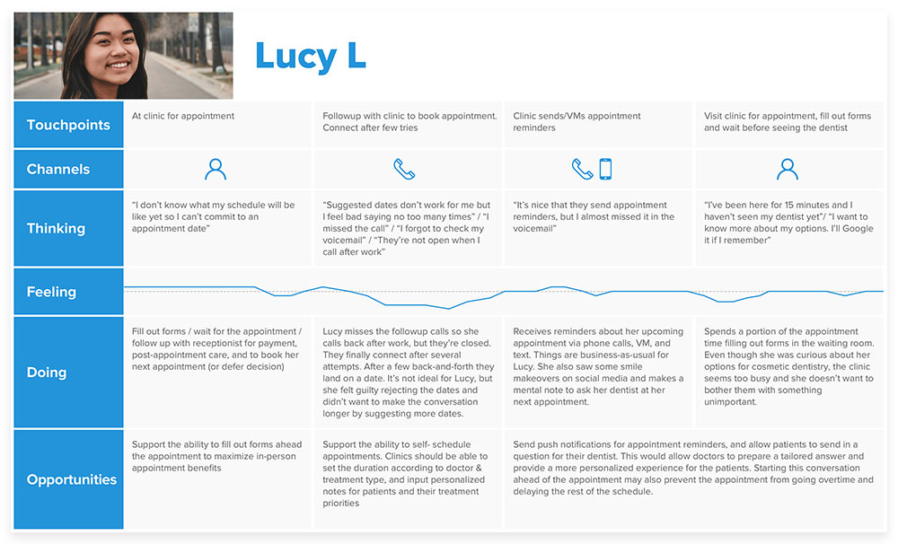
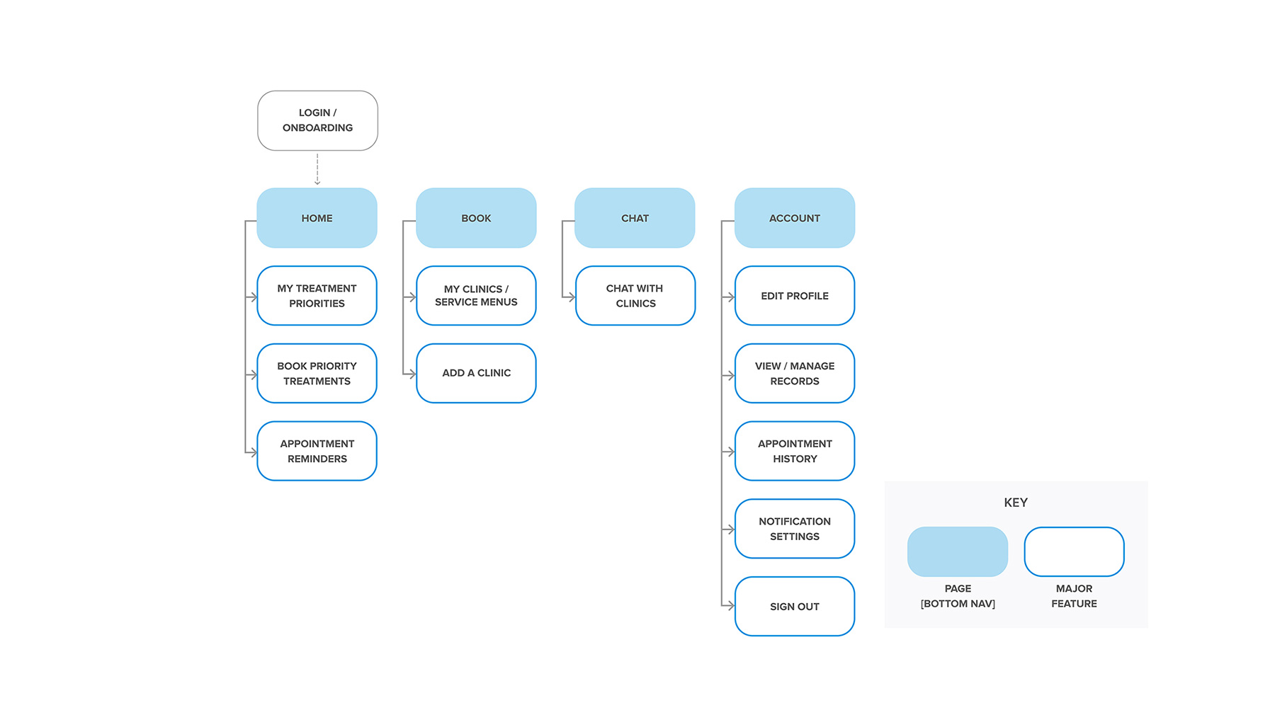
Next, I turned research insights into user stories to define the app’s major features. I mapped out the information architecture to develop feature hierarchies, and to get a better sense of how I might organize the pages and their contents to help Lucy complete her tasks.
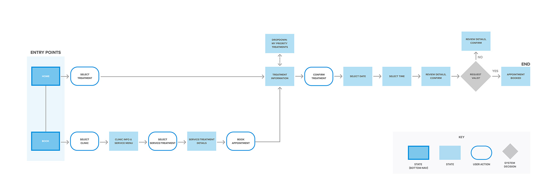
User flow
I developed flows for two key tasks: appointment booking and service discovery. I wanted to see the app holistically and design a seamless experience with no dead ends (given that Lucy may be booking a specific appointment or be inspired to book something else while using the app). To support this flexibility, I designed multiple entry points for booking an appointment: through the main page, priority treatments dropdown, and the clinic menu, through which Lucy can learn about treatments with the information provided or via integrated technologies (such as AR smile design).
Ideation
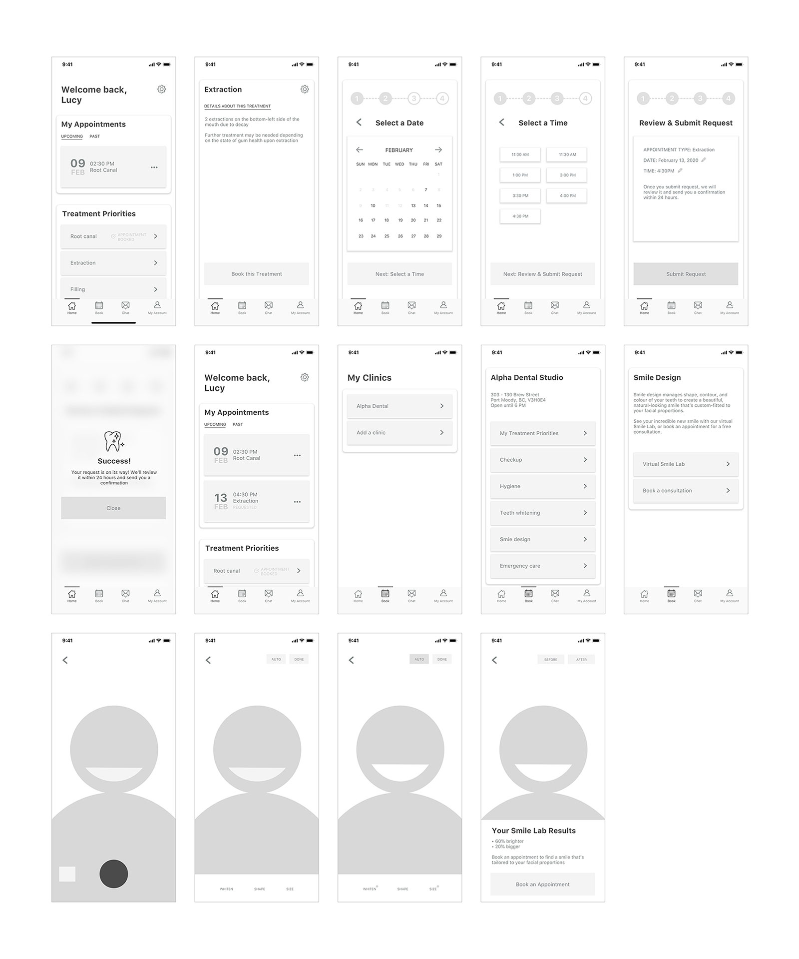
Next, I sketched out the screens and created the first set of wireframes. I considered designing for larger screens to allow for more comprehensive view of calendars and treatment priorities, but ultimately decided to prioritize mobile design to underscore the solution’s ease of use while on-the-go.

Usability testing
I conducted 2 rounds of usability testing with 5 participants each. The first round gave me great feedback for improving UX copy and information architecture. I went back to the ideation stage to re-evaluate content organization, iterated, then moved onto round 2 testing.
 Screens should match user expectations
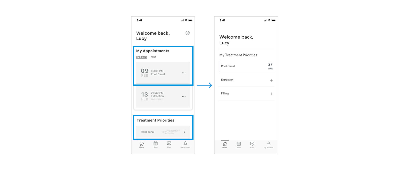
Before: Having separate cards for 'My Appointments’ and ‘Treatment Priorities’ confused users, especially when booking one of their treatment priorities caused a duplicate entry under 'Upcoming Appointments'.
After: Merged the two sections into one. Cleaner layout with indicators (bar, date) let users know which treatments are booked.
CTA should call to action
Before: Some CTA copies were confusing and redundant, causing unnecessary distraction.
After: Concise and informative CTAs (omitted ‘Next’ in copies).

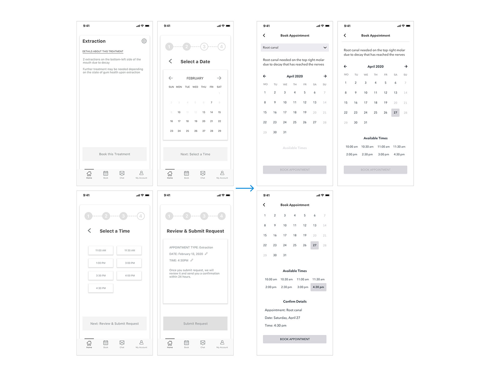
Users should navigate flows, not pages
Before: Appointment booking was split into 4 different pages: treatment information, selecting date, time, and reviewing appointment details.
After: The booking process was re-designed as a single, continuously scrolling page. Selecting a treatment reveals more info and the calendar. Selecting a date reveals available times, and so on. CTA activates when user makes all required selections. This redesign helps to remove unnecessary friction by reducing extra clicks and page loads.
I designed the second set of wireframes to be more minimalistic, and conducted A/B testing to get feedback around UI design. All participants felt the first design seemed more informative, but preferred the open and minimalistic feel of the second. But the latter may have pushed minimalism too far, and one participant couldn’t figure out how to book an appointment via Treatment Priorities. This was a really interesting finding for me, and opened my eyes to the huge implications that subtle differences in UI can make.
Before: From the main page, user can tap on a treatment (>) to start the booking process.
After: The second wireframe had (+) instead of (>), giving the impression that tapping a treatment would show more information rather than taking the user to the booking flow. Personally, this kind of user perception of UI components was a valuable learning curve.

Scaling the design's impact
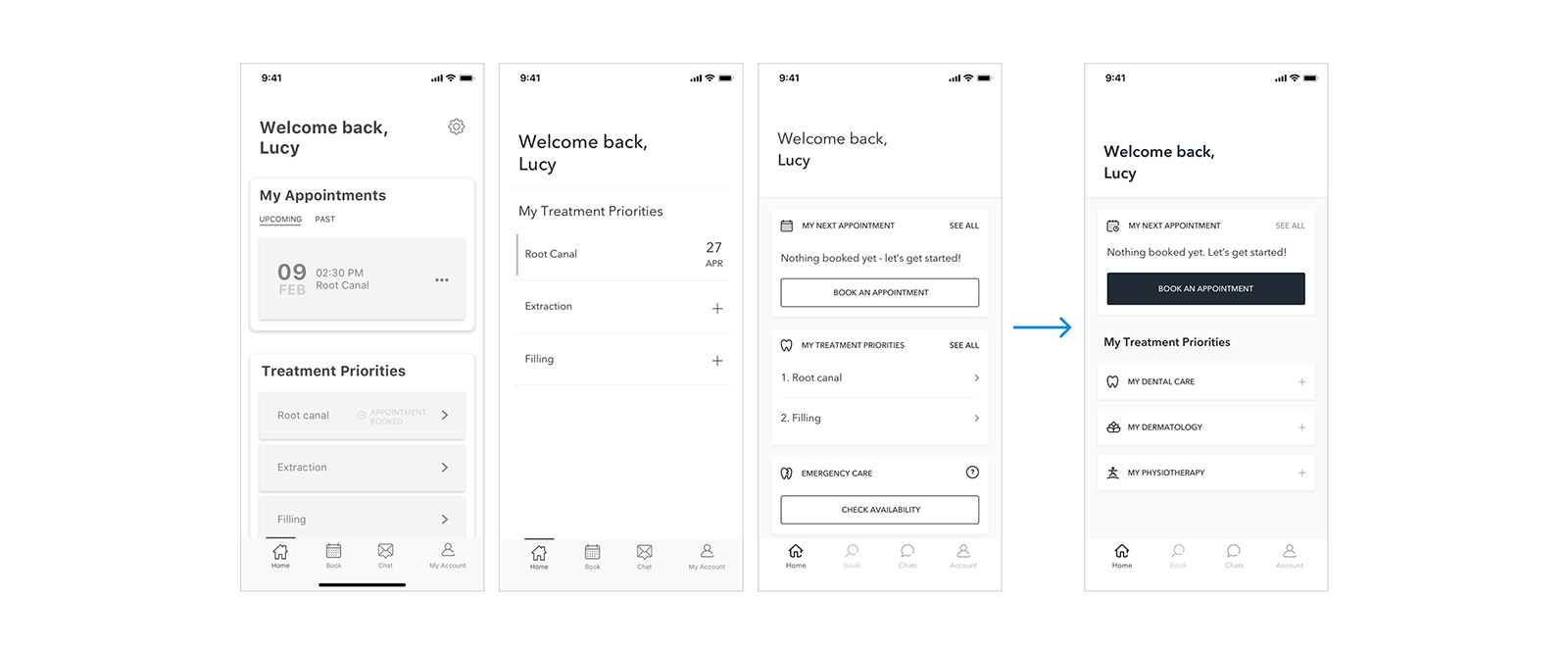
At this point I was pretty deep into the dental problem space, but feedback from my peers and educators helped me understand that the app could easily scale beyond dentistry to help patients like Lucy track all of her healthcare needs. I re-evaluated the app’s design and information architecture, and built the changes into the final wireframes.
Developing a visual identity
Blue is the most commonly used colour for healthcare apps, while mint is often associated with health and wellness. I contrasted these colours with a warm citrus to instill a sense of calm in what should be a stress-free process.
In some cultures, citrus fruits symbolize energy and good health, while a cross symbol is often associated with medicine. Citrus+ pays homage to both references.

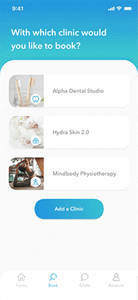
An all-in-one healthcare solution
Citrus+ gives patients an easy way for managing their healthcare priorities by providing the following benefits:
 Transparent scheduling process
Show available dates and times so that patients can choose what works best for them
Easy access to treatment priorities
Support informed-decision making by ranking priority treatments, accompanied by personalized notes from care providers
Rapid service discovery
Help patients explore procedures, and integration of advanced technologies offers rich experiences for discovery and education
By giving patients greater control over their healthcare journey, Citrus+ helps automate front-office duties so that clinic staff can allocate their efforts towards more complex tasks.


Learnings and future explorations
I was very happy with the result of my project! Completing this project and learning new tools such as Sketch and Principle (in addition to other assignments) was challenging, but also incredibly rewarding - especially as I got to hear direct feedback from test participants along the way, and know that what I'm working on may directly contribute to making their lives easier. In that sense, completing this project felt like a personal win.
Something I would do differently in the future: I would conduct a more thorough investigation into the information architecture, especially if there are other systems that the new product or feature may need to work with. This will help me better understand how key tasks may fit within the larger system.
For next steps, I would like to explore ways to incentivize patients to continue booking appointments by developing a reward system with participating clinics, or use my initial research to design a counterpart solution for the clinics. This would require further testing and research into any existing reward systems, as well as clinic management solutions that are currently on the market.
(or just drop me a line to say hello  )
)
All Rights Reserved © Kristine Hur 2022